Have you ever wanted to create some React form elements, but didn’t how? Good news! In this tutorial, you will learn how to create a number of simple React form elements. What elements? You will create elements such as button, datalist, checkbox, label, input and radio. These are probably the most often used form elements. If you are just a beginner, don’t worry. This tutorial will be very simple and beginner-friendly. If not, I hope you will still enjoy it.
Table of Contents:
Briefing
HTML and assets
CSS (Sass)
Styling the React input elements
All in one piece
JavaScript
Creating Button component
Creating Datalist component
Creating Checkbox component
Creating Label component
Creating Input component
Creating Radio component
Creating Form component
All in one piece
Live demo on CodePen.
Briefing
In the previous React tutorial, we created a simple flipping card. A lot of you liked that tutorial. Also, some of you asked for another very simple tutorial focused on React. The result is this tutorial on creating simple React form elements. Form elements are one of the most often used elements in web design. And, I would say that these elements are also quite common in app development. To make this tutorial accessible to people with wide range of skills, we are going to keep it simple.
We will create React form elements web designers and developers are working on a daily basis. These form elements include text, email, number and password inputs. We will also work with radio buttons and checkboxes. In addition, we will create simple select and datalist. And, let’s not forget other basic elements such as label and button. I hope you will enjoy this tutorial focused on creating simple React form elements.
HTML and assets
The first thing we have to do is putting together necessary assets. I decided to exclude any external resources that are not necessary. As a result, we will need only three assets for this whole tutorial. The first two are React and ReactDOM. The third one is Babel compiler (or transpiler?). React and ReactDom are necessary. Babel is optional. When I work with React, I like to write in ES6 JavaScript syntax. I wanted to do the same in this React form elements tutorial.
The problem is that not all browsers provide stable support for ES6. In addition, many features are not implemented at all. So, in order to make the code more usable, without having to use ECMAScript 5 syntax, we can use Babel. Then, our ES6 syntax will be compiled into older ECMAScript 5 syntax. As a result, everyone will be happy, hopefully. Usually, I like to include normalize stylesheet. Today is exception. There will be no external CSS stylesheet.
This means that we can move to the step number two. We need to create container we will later use to render the form containing all React form elements. So, let’s create simple div element with class “react-form-container”. And … That is all we need to do. HTML part is finished.
Code:
<div class="react-form-container"></div>
CSS (Sass)
Step number two is creating some basic styles for the React form elements we are going to create. Before we get any further, we should set some default font-size and font-family for the document. Feel free to use any font you like. 16 pixels as font-size for html will be enough. For body, let’s use font-size of 100%. As font-family, well, let’s keep this tutorial really simple and use “sans-serif”.
Code:
html {
 font-size: 16px;
}

body {
 font: 100% / 1.414 sans-serif;
}
Next, let’s work on styles for the React form elements. Also, let’s add a few for the form itself. Styles for the form are optional. I used them just to position the form in the demo on Codepen. So, feel free to skip these lines. After the form, let’s style fieldset element. I used this element as a container for React form elements. You can use div if you want. However, I think that fieldset is a better option since we are working with forms.
The majority of styles for fieldset will reset the default browser styles. We will remove margins, padding and border. Next, we will use margin-top for every adjacent sibling fieldset to add a bit of space between multiple fieldsets.
Code:
form {
 margin-right: auto;
 margin-left: auto;
 max-width: 320px;
}

fieldset {
 padding: 0;
 margin: 0;
 border: 0;

 & + & {
  margin-top: 24px;
 }
}
After we took care about form and fieldset, let’s style labels and individual React form elements. In case of labels, we will use margin-bottom to add some space between them and inputs. Let’s also change the display to “block”. As a result, labels and inputs will be on separate lines. Lastly, we can change the color.
Code:
label {
 margin-bottom: 8px;
 display: block;
 color: #2b2e4a;
}
Styling the React input elements
The previous elements were boring. Let’s fix this now by using more creative styling for the remaining React form elements. For all inputs (except radios and checkboxes), selects and textarea let’s set the width to “100%”. Then, padding to “8px” and also remove all borders except the bottom one. For focus, we will remove the outline and change the color of the bottom border. Also, we can use transition to animate this change.
Code:
input:not([type=checkbox]):not([type=radio]),
select,
textarea {
 padding: 8px;
 width: 100%;
 border-top: 0;
 border-right: 0;
 border-bottom: 1px solid #bdc3c7;
 border-left: 0;
 transition: border-bottom-color .15s ease-in;

 &:focus {
  outline: 0;
  border-bottom-color: #3fc1c9;
 }
}
Next React form elements on the list are radios and checkboxes. This will be quick. We will use margin-right and set it to “8px”. We will wrap these elements inside labels. Margin will add a bit of space between them and the text of the label. Another quick task is setting resize property of the textarea to “vertical”. Next is button. We will use left and right margins and display of “block” to center it horizontally.
Next, let’s add some padding and change the font-size to “16px”. In addition, we can change the background-color, color and remove borders. To make the button more pleasing, we can make the borders rounder. Let’s also set the cursor to “pointer”, just to make sure. Finally, we can add some styles for focus, hover and active states. Changing background-color will do the job.
Code:
input[type=checkbox],
input[type=radio] {
 margin-right: 8px;
}

textarea {
 resize: vertical;
}

button {
 margin-right: auto;
 margin-left: auto;
 display: block;
 padding: 8px 16px;
 font-size: 16px;
 color: #fff;
 background-color: #3fc1c9;
 border: 0;
 border-radius: 2px;
 cursor: pointer;
 transition: background-color .15s ease-in;

 &:focus:active {
  background-color: darken(#3fc1c9, 8%);
 }

 &:focus {
  outline: 0;
 }

 &:hover {
  background-color: lighten(#3fc1c9, 15%);
 }
}
All in one piece
Before we move to JavaScript and React, let’s take all the bits and pieces of CSS (Sass) and put it together.
Code:
html {
 font-size: 16px;
}

body {
 font: 100% / 1.414 sans-serif;
}

form {
 margin-right: auto;
 margin-left: auto;
 max-width: 320px;
}

fieldset {
 padding: 0;
 margin: 0;
 border: 0;

 & + & {
  margin-top: 24px;
 }
}

label {
 margin-bottom: 8px;
 display: block;
 color: #2b2e4a;
}

input:not([type=checkbox]):not([type=radio]),
select,
textarea {
 padding: 8px;
 width: 100%;
 border-top: 0;
 border-right: 0;
 border-bottom: 1px solid #bdc3c7;
 border-left: 0;
 transition: border-bottom-color .15s ease-in;

 &:focus {
  outline: 0;
  border-bottom-color: #3fc1c9;
 }
}

input[type=checkbox],
input[type=radio] {
 margin-right: 8px;
}

textarea {
 resize: vertical;
}

button {
 margin-right: auto;
 margin-left: auto;
 display: block;
 padding: 8px 16px;
 font-size: 16px;
 color: #fff;
 background-color: #3fc1c9;
 border: 0;
 border-radius: 2px;
 cursor: pointer;
 transition: background-color .15s ease-in;

 &:focus:active {
  background-color: darken(#3fc1c9, 8%);
 }

 &:focus {
  outline: 0;
 }

 &:hover {
  background-color: lighten(#3fc1c9, 15%);
 }
}
JavaScript
It is time to dive deep into the best part of this tutorial. In previous section, we created a decent amount of styles. However, we didn’t see anything yet. Let’s change it and create the first of React form elements. Yes, it will be the good old button. But before that, we can store the div we created inside a variable so we quickly access it later.
Code:
const formContainer = document.querySelector('.react-form-container');
Creating Button component
Okay, let’s create the button. We will use button element with type and value attributes. As values, these attributes will refer to the props with the same name. Between the tags, we will render the text extracted from text attribute. Finally, we will wrap the button inside fieldset.
Note: Any time we use OR operator with “null” it means that the component will either use data provided via props or it will not use the attribute. So, when you don’t use one of these optional attributes, it will not be rendered in HTML.
Code:
// Create component for button
class Button extends React.Component {
 render() {
  return (
   <fieldset>
    <button
     type={this.props.type || 'button'}
     value={this.props.value || null}
    >
     {this.props.text}
    </button>
   </fieldset>
  );
 }
};
Creating Datalist component
The second element we will create will be datalist. I know that this element is not used as often. However, that doesn’t mean we can’t include it among the React form elements. Options for the datalist will be provided via options prop. We will use split() method to create an array from these option. Then, we will use map() function to cycle through this array and return option tag for each. Next, we use Label component, with necessary attributes, we will create later.
After that, we need to use input element so we can work with the datalist. Finally, we will create the datalist. It will contain one default option and then we will render the list we generated before.
Code:
// Create component for datalist input
class Datalist extends React.Component {
 render() {
  // Get all options from option prop
  const dataOptions = this.props.options.split(', ');

  // Generate list of options
  const dataOptionsList = dataOptions.map((dataOption, index) => {
   return <option key={index} value={dataOption} />
  });

  return (
   <fieldset>
    <Label
     hasLabel={this.props.hasLabel}
     htmlFor={this.props.htmlFor}
     label={this.props.label}
    />

    <input list={this.props.htmlFor} />

    <datalist
     defaultValue=''
     id={this.props.htmlFor}
     name={this.props.name || null}
     required={this.props.required || null}
    >
     <option value='' disabled>Select one option</option>

     {dataOptionsList}
    </datalist>
   </fieldset>
  );
 }
};
Creating Checkbox component
Next on our list of React form elements is a component for checkbox. Checkbox component will use attributes such as id, name, required and type. We can make some of these attributes optional. As I mentioned in the part about styling, we will wrap checkbox element inside label.
Code:
// Create component for checkbox input
class Checkbox extends React.Component {
 render() {
  return (
   <fieldset>
    <label
     htmlFor={this.props.htmlFor}
     label={this.props.label}
    >
     <input
      id={this.props.htmlFor}
      name={this.props.name || null}
      required={this.props.required || null}
      type='checkbox'
     />
     {this.props.label}
    </label>
   </fieldset>
  );
 }
}
Creating Label component
The next component, the label, we will create will be quite small. We will need only to specify the value of htmlFor attribute and text inside the label. Props htmlFor and label will do the work. We can also implement function to not to use label at all. To do so, we will use if statement and check hasLabel prop. If value of this prop will be “true” we will return code for label. Otherwise, nothing. Except radios and checkboxes, each of our React form elements will use this Label component.
Code:
// Create component for label
class Label extends React.Component {
 render() {
  if (this.props.hasLabel === 'true') {
   return <label htmlFor={this.props.htmlFor}>{this.props.label}</label>
  }
 }
}
Creating Input component
Input will be probably the most often used component from these React form elements. Because there is a number of inputs, let’s make it more flexible. We will define following attributes: id, max, min, name, placeholder, required, step and type. Again, some of these attributes will be optional because we will not need all of them all the time. Type will use “Text” as default value.
Code:
// Create component for input
class Input extends React.Component {
 render() {
  return (
   <fieldset>
    <Label
     hasLabel={this.props.hasLabel}
     htmlFor={this.props.htmlFor}
     label={this.props.label}
    />
     <input
      id={this.props.htmlFor}
      max={this.props.max || null}
      min={this.props.min || null}
      name={this.props.name || null}
      placeholder={this.props.placeholder || null}
      required={this.props.required || null}
      step={this.props.step || null}
      type={this.props.type || 'text'}
     />
   </fieldset>
  );
 }
}
Creating Radio component
Radio and checkboxes are quite similar. For this reason, the components for these two React form elements will look almost the same as well. The only difference will be that we will set type attribute to “radio”.
Code:
// Create component for radio input
class Radio extends React.Component {
 render() {
  return (
   <fieldset>
    <label
     htmlFor={this.props.htmlFor}
     label={this.props.label}
    >
     <input
      id={this.props.htmlFor}
      name={this.props.name || null}
      required={this.props.required || null}
      type='radio'
     />
     {this.props.label}
    </label>
   </fieldset>
  );
 }
}
Creating Select component
Next component is select. This component will use similar code to datalist. We will need to make only few changes. First, we should change the names of variables. This is not necessary, but it will help us avoid possible confusions. Next, we will get rid in input element and replace datalist tags with select tags. We will also use opening and closing tags for each option.
Code:
// Create component for select input
class Select extends React.Component {
 render() {
  // Get all options from option prop
  const selectOptions = this.props.options.split(', ');

  // Generate list of options
  const selectOptionsList = selectOptions.map((selectOption, index) => {
   return <option key={index} value={index}>{selectOption}</option>
  });

  return (
   <fieldset>
    <Label
     hasLabel={this.props.hasLabel}
     htmlFor={this.props.htmlFor}
     label={this.props.label}
    />

    <select
     defaultValue=''
     id={this.props.htmlFor}
     name={this.props.name || null}
     required={this.props.required || null}
    >
     <option value='' disabled>Select one option</option>

     {selectOptionsList}
    </select>
   </fieldset>
  );
 }
};
Creating Textarea component
The last item on our list of React form elements is textarea. This component will use some of the code we used for Input component. We will also add attributes for cols and rows. These attributes will receive value from props of the same name. Also, let’s make these attributes optional because … Well, they are not necessary. And, CSS is better for changing the size of textarea.
Code:
// Create component for textarea
class Textarea extends React.Component {
 render() {
  return (
   <fieldset>
    <Label
     hasLabel={this.props.hasLabel}
     htmlFor={this.props.htmlFor}
     label={this.props.label}
    />

    <textarea
     cols={this.props.cols || null}
     id={this.props.htmlFor}
     name={this.props.name || null}
     required={this.props.required || null}
     rows={this.props.rows || null}
    >
    </textarea>
   </fieldset>
  );
 }
};
Creating Form component
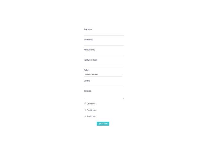
I know. Text area was supposed to be the last component. However, we need some place where we can put our React form elements. Form component will is the best choice. Form component will use only two attributes: method and action. Next, we will use all the components we previously created with some random content so you can see that everything works. And, finally, we will render the Form component inside the div container we created in the beginning.
Code:
// Create component for form
class Form extends React.Component {
 render() {
  return (
   <form method='' action=''>
    <Input
     hasLabel='true'
     htmlFor='textInput'
     label='Text input'
     required='true'
     type='text'
    />

    <Input
     hasLabel='true'
     htmlFor='emailInput'
     label='Email input'
     required='true'
     type='email'
    />

    <Input
     hasLabel='true'
     htmlFor='numberInput'
     label='Number input'
     required='true'
     type='number'
     min='0.5'
     max='100'
     step='0.5'
    />

    <Input
     hasLabel='true'
     htmlFor='passwordInput'
     label='Password input'
     required='true'
     type='password'
    />

    <Select
     hasLabel='true'
     htmlFor='select'
     label='Select'
     options='one, two, three, option four, five'
     required='true'
    />

    <Datalist
     hasLabel='true'
     htmlFor='datalist'
     label='Datalist'
     options='Chrome, Edge, Firefox, Internet Explorer, Opera, Safari, Vivaldi'
     required='true'
    />

   <Textarea
     hasLabel='true'
     htmlFor='textarea'
     label='Textarea'
     required='true'
    />

    <Checkbox
     hasLabel='true'
     htmlFor='checkbox'
     label='Checkbox'
     required='true'
    />

    <Radio
     hasLabel='true'
     htmlFor='radioOne'
     label='Radio one'
     name='radios'
     required='true'
    />

    <Radio
      hasLabel='true'
      htmlFor='radioTwo'
      label='Radio two'
      name='radios'
      required='true'
     />

     <Button
      type='submit'
      value='submit'
      text='Send form'
     />
   </form>
  )
 }
}

// Render Form component
ReactDOM.render(<Form />, formContainer);
All in one piece
Just like we did with CSS (Sass), let’s put all the pieces of JavaScript together.
Code:
// Create component for button
class Button extends React.Component {
 render() {
  return (
   <fieldset>
    <button
     type={this.props.type || 'button'}
     value={this.props.value || null}
    >
     {this.props.text}
    </button>
   </fieldset>
  );
 }
}

// Create component for datalist input
class Datalist extends React.Component {
 render() {
  // Get all options from option prop
  const dataOptions = this.props.options.split(', ');

  // Generate list of options
  const dataOptionsList = dataOptions.map((dataOption, index) => {
   return <option key={index} value={dataOption} />
  });

  return (
   <fieldset>
    <Label
     hasLabel={this.props.hasLabel}
     htmlFor={this.props.htmlFor}
     label={this.props.label}
    />

    <input list={this.props.htmlFor} />

    <datalist
     defaultValue=''
     id={this.props.htmlFor}
     name={this.props.name || null}
     required={this.props.required || null}
    >
     <option value='' disabled>Select one option</option>

     {dataOptionsList}
    </datalist>
   </fieldset>
  );
 }
}

// Create component for checkbox input
class Checkbox extends React.Component {
 render() {
  return (
   <fieldset>
    <label
     htmlFor={this.props.htmlFor}
     label={this.props.label}
    >
     <input
      id={this.props.htmlFor}
      name={this.props.name || null}
      required={this.props.required || null}
      type='checkbox'
     />
     {this.props.label}
    </label>
   </fieldset>
  );
 }
}

// Create component for label
class Label extends React.Component {
 render() {
  if (this.props.hasLabel === 'true') {
   return <label htmlFor={this.props.htmlFor}>{this.props.label}</label>
  }
 }
}

// Create component for input
class Input extends React.Component {
 render() {
  return (
   <fieldset>
    <Label
     hasLabel={this.props.hasLabel}
     htmlFor={this.props.htmlFor}
     label={this.props.label}
    />
     <input
      id={this.props.htmlFor}
      max={this.props.max || null}
      min={this.props.min || null}
      name={this.props.name || null}
      placeholder={this.props.placeholder || null}
      required={this.props.required || null}
      step={this.props.step || null}
      type={this.props.type || 'text'}
     />
   </fieldset>
  );
 }
}

// Create component for radio input
class Radio extends React.Component {
 render() {
  return (
   <fieldset>
    <label
     htmlFor={this.props.htmlFor}
     label={this.props.label}
    >
     <input
      id={this.props.htmlFor}
      name={this.props.name || null}
      required={this.props.required || null}
      type='radio'
     />
     {this.props.label}
    </label>
   </fieldset>
  );
 }
}

// Create component for select input
class Select extends React.Component {
 render() {
  // Get all options from option prop
  const selectOptions = this.props.options.split(', ');

  // Generate list of options
  const selectOptionsList = selectOptions.map((selectOption, index) => {
   return <option key={index} value={index}>{selectOption}</option>
  });

  return (
   <fieldset>
    <Label
     hasLabel={this.props.hasLabel}
     htmlFor={this.props.htmlFor}
     label={this.props.label}
    />

    <select
     defaultValue=''
     id={this.props.htmlFor}
     name={this.props.name || null}
     required={this.props.required || null}
    >
     <option value='' disabled>Select one option</option>

     {selectOptionsList}
    </select>
   </fieldset>
  );
 }
}

// Create component for textarea
class Textarea extends React.Component {
 render() {
  return (
   <fieldset>
    <Label
     hasLabel={this.props.hasLabel}
     htmlFor={this.props.htmlFor}
     label={this.props.label}
    />

    <textarea
     cols={this.props.cols || null}
     id={this.props.htmlFor}
     name={this.props.name || null}
     required={this.props.required || null}
     rows={this.props.rows || null}
    >
    </textarea>
   </fieldset>
  );
 }
}

// Create component for form
class Form extends React.Component {
 render() {
  return (
   <form method='' action=''>
    <Input
     hasLabel='true'
     htmlFor='textInput'
     label='Text input'
     required='true'
     type='text'
    />

    <Input
     hasLabel='true'
     htmlFor='emailInput'
     label='Email input'
     required='true'
     type='email'
    />

    <Input
     hasLabel='true'
     htmlFor='numberInput'
     label='Number input'
     required='true'
     type='number'
     min='0.5'
     max='100'
     step='0.5'
    />

    <Input
     hasLabel='true'
     htmlFor='passwordInput'
     label='Password input'
     required='true'
     type='password'
    />

    <Select
     hasLabel='true'
     htmlFor='select'
     label='Select'
     options='one, two, three, option four, five'
     required='true'
    />

    <Datalist
     hasLabel='true'
     htmlFor='datalist'
     label='Datalist'
     options='Chrome, Edge, Firefox, Internet Explorer, Opera, Safari, Vivaldi'
     required='true'
    />

   <Textarea
     hasLabel='true'
     htmlFor='textarea'
     label='Textarea'
     required='true'
    />

    <Checkbox
     hasLabel='true'
     htmlFor='checkbox'
     label='Checkbox'
     required='true'
    />

    <Radio
     hasLabel='true'
     htmlFor='radioOne'
     label='Radio one'
     name='radios'
     required='true'
    />

    <Radio
      hasLabel='true'
      htmlFor='radioTwo'
      label='Radio two'
      name='radios'
      required='true'
     />

     <Button
      type='submit'
      value='submit'
      text='Send form'
     />
   </form>
  )
 }
}

// Render Form component
ReactDOM.render(<Form />, formContainer);
Closing thoughts on react form elements
Congrats, you’ve just finished this tutorial and created a number of React form elements! This tutorial was very easy and simple. It was mostly practice in using props with the right attributes and how to generate options for select and datalist. For many, this was probably not a challenge. Still, I hope you had fun and enjoyed this tutorial. I promise that next time, I will prepare something more challenging.
Thank you very much for your time.
Want more?
If you liked this article, please subscribe or follow me on Twitter.
The post Learn How to Create Simple React Form Elements appeared first on Alex Devero Blog.